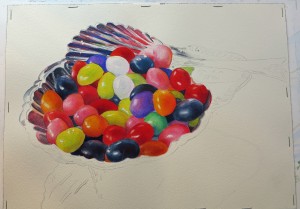
I completed the silver bowl using the alizarin crimson, jenkins green and indigo mix and added a glaze of red on the handle of the dish to separate it from the spoon. The bright white highlights on the dish were toned down with a pale wash of the silver gray allowing the brightest areas to be in and around the bowl of the spoon. Another wash of dioxazine purple was added to the background to darken it. Project complete, now I just need a title 🙂
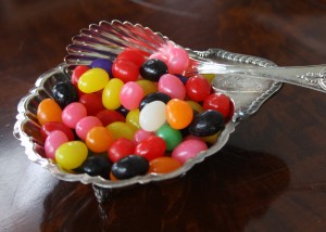
We have been painting jelly beans in a silver nut dish in class the last few weeks. Let me take you through the process. First the reference photo, this will be fun to paint, all those colors and reflective surfaces. It looks difficult right now but when it is finished my students will be proud of all their hard work.

I am using fluid acrylics on 140 lb cold press 10 x 14 paper. Colors being used –
Hansa Yellow Medium
Transparent Pyrolle Orange
Dioxazine Purple
Quinacridone Red
Pthalo Blue (Red Shade)
Pyrolle Red
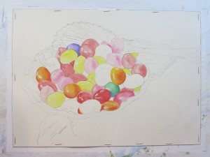
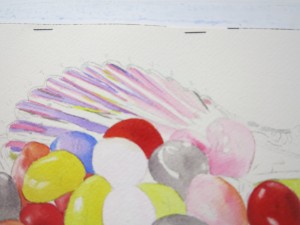
We began by painting the jelly beans first, which is always the most fun. I painted each bean with a light local color wash .


After studying the reference photo I decided I didn’t like the two red jelly beans at the top of the pile directly in front of the spoon, they were too dark and did not allow for a center of interest. Using some Daniel Smith watercolor ground I covered the red and pink jelly beans and finished painting the remaining beans before deciding what color I wanted to use.

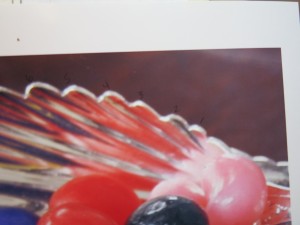
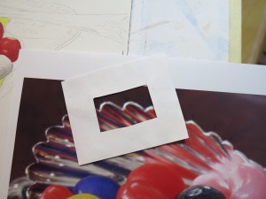
In the meantime I started putting down some of the colors in the spoon. Attempting to follow the intricacies of the reflective colors in the spoon was a bit daunting so I blew up the photo and numbered the flutes on the spoon. I also used a square of paper with a ‘peep hole’ cut out in the middle to use as a guide.


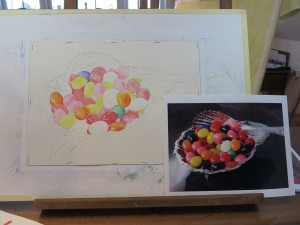
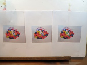
When unsure of what color I want to use in a painting I will often print off several photos of the painting in progress and use colored pencils to experiment with various colors. Sometimes if I’m really feeling adventurous I’ll use photoshop, however that usually ends in total frustration! Colored pencils are way easier 🙂

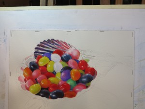
I decided to paint the white bean in the front purple, a compliment to the neighboring orange bean, and then the two remaining beans will be white which will draw the viewers eye to the spoon. However, white is never just white, there will be various colors from neighboring beans reflected in the white.

I am now in the process of painting the silver nut dish, working my way around. I am using a mix of Alizarin Crimson, Jenkins Green and Indigo for the silver grey in the bowl.

Stay tuned.
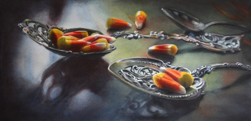
 "Silver Corn" -- Watermedia on paper
“Silver Corn”
This is a new piece I finished in July titled “Silver Corn”. It is fluid acrylic and transparent watercolor on Arches 140 lb paper measuring approximately 10 x 20″. Inspiration came to me when cleaning my mother’s sliver nut spoons in preparation for Thanksgiving several years ago. I happened to have some candy corn … well, truth be told, there is always candy corn in my house in the fall. I thought the color and texture would be a great contrast to the silver along with the reflective value of the candy corn. Hmmm, I think I’m hungry now….
Posted on Monday, August 19, 2013 at 4:52pm
Filed in
New Works,
Painting
Comments Off on Nuts About Candy Corn

